Case in point...
A part of me thinks that kids like bold, bright colors. And, that teachers should have a classroom that they feel inspired in.
Another part of me thinks, "Wow. I can do something really different." What I've been contemplating for weeks now, is how to marry the two: bold, bright learning environment with bulletin boards on the walls with a more neutral room with only student work up on the walls. I'm hoping what I'm beginning to envision in my mind is going to satisfy my district's initiatives while staying true to myself, my own sense of style, and what I believe in.
As I go through this process, I will post my ideas here, of course.
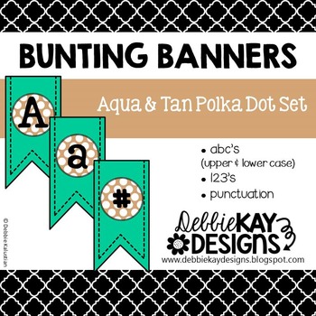
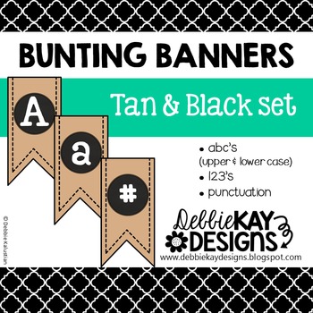
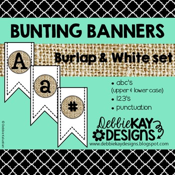
One of the things I'm going to do is still have some bulletin boards - not nearly the amount I had before - but with a more neutral palette and more student-focused. So, one of the things I've been working on is creating some new bunting banners.
These bunting banners all mix and match and they are mostly neutral; however, I do see myself adding a touch of color here and there (hence, the aqua!). I can't help it! I love color and I can't totally eliminate it.
These Bunting Banners were all posted to TPT today if you are interested in checking them out.

Bunting Banners - Aqua & Tan Polka Dots

Bunting Banners - Tan & Black

Bunting Banners - Burlap & White
Thanks for stopping by!


No comments:
Post a Comment